
Brand identity and logo design work
Explore brand identity design, logo design, business collateral, and social graphics created by 43˚ North Design for businesses across different industries.
The work doesn’t follow one house style. Each business came in with a different need. The work starts there, not with a set style or the same answer dressed up a few different ways.
-
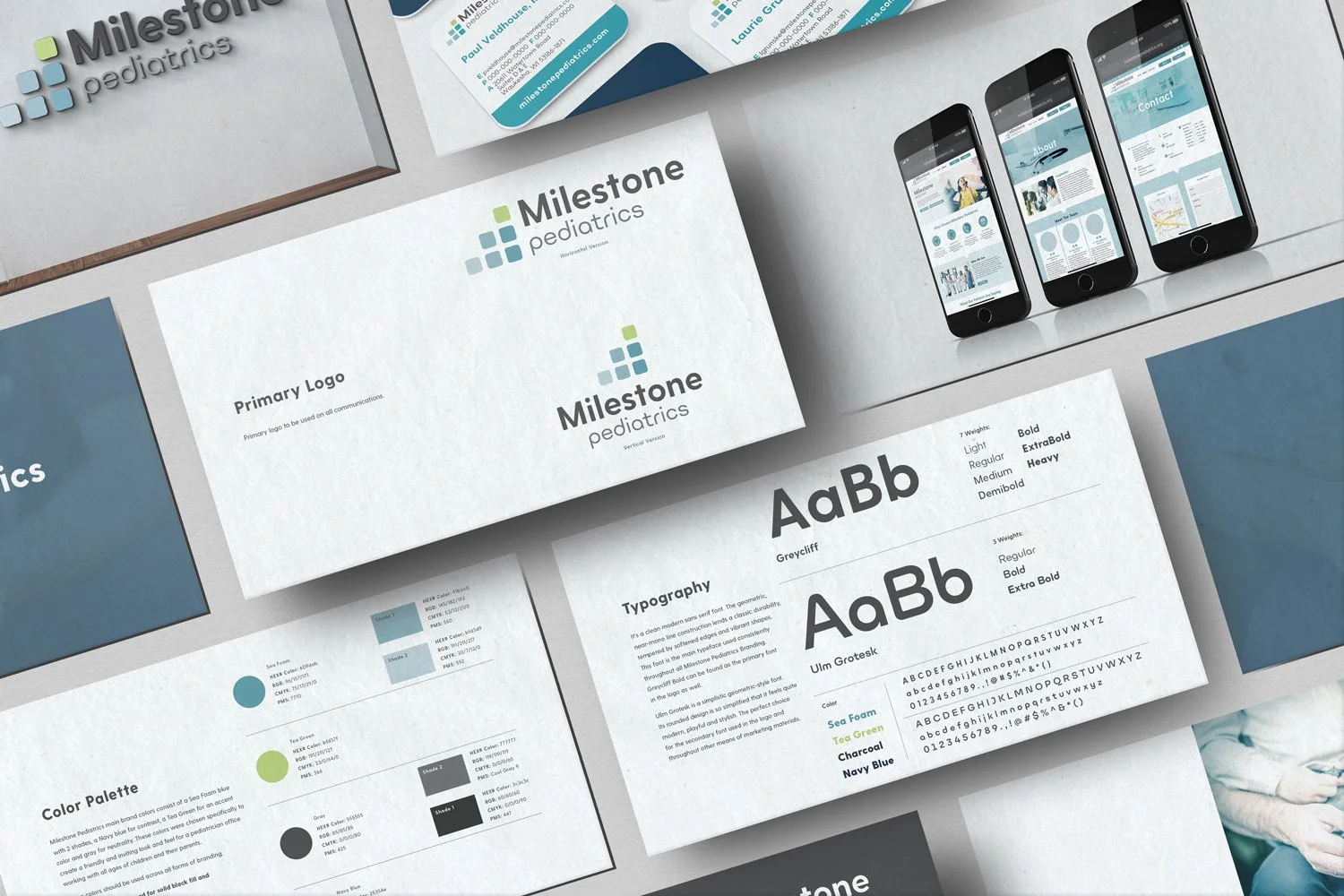
Milestone Pediatrics, a new practice in Waukesha, WI, was started by three doctors who left large, hospital-run clinics to build a more patient-focused practice of their own. Their patients were coming with them, so the challenge was not to create trust from scratch. It was to carry that trust into a new name, bring three doctors together under one clear identity, and make the transition feel familiar without looking like an extension of the hospital system. Professional, but not institutional. Friendly, but never childish.
43˚ North Design built the identity around growth and continuity. The logo starts with a single rounded block, then adds more as it rises, reflecting the stages and milestones children move through over time, with the practice there along the way. Softened forms, sea foam blues, navy, and tea green keep the identity calm and welcoming. More importantly, the system gives the doctors one recognizable presence wherever families encounter the new practice.
-
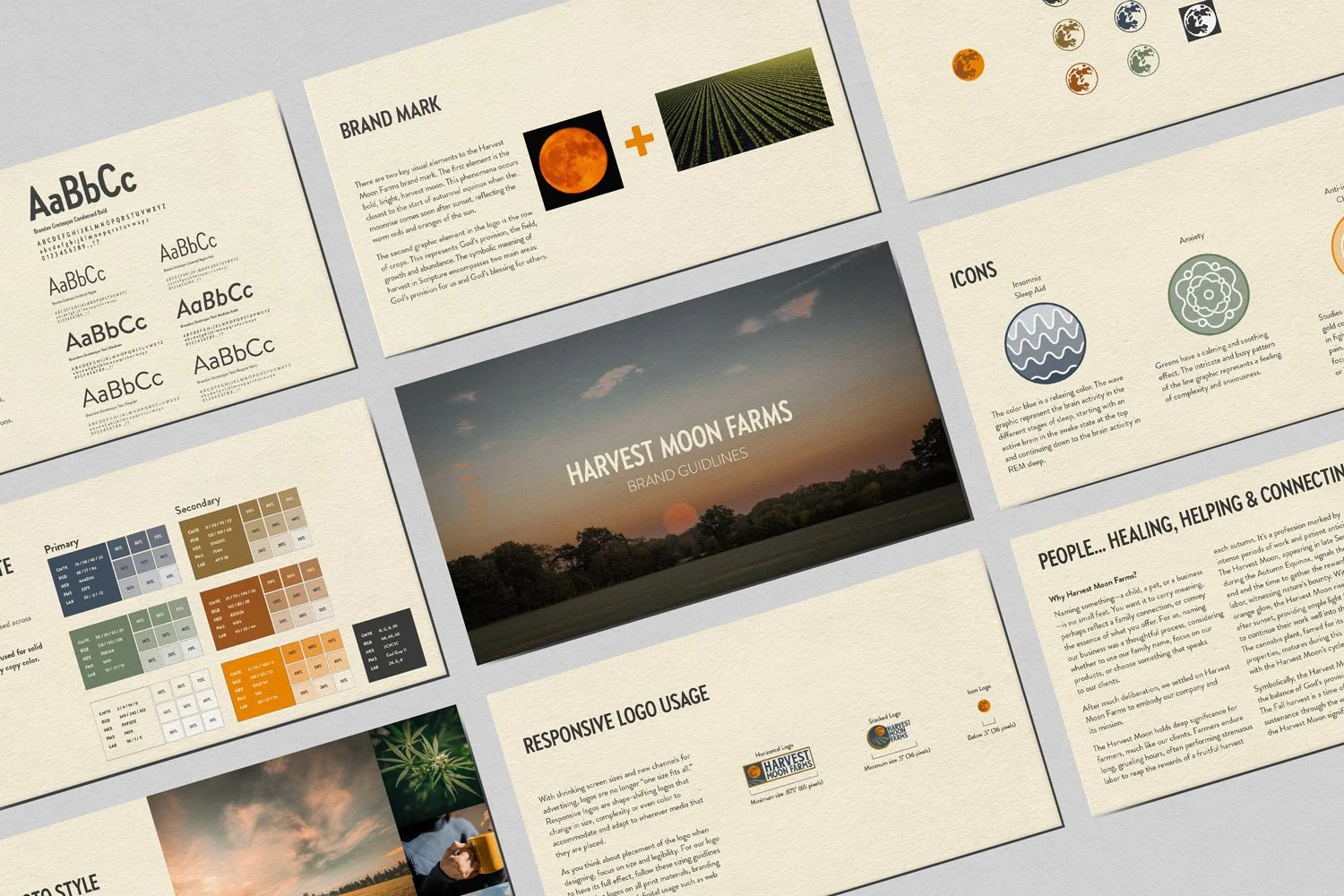
Harvest Moon Farms is a family-run farm in Sparta, Missouri, built around health, service, stewardship, and faith. Its first products came from hemp, but the long-term plan was bigger than any single oil or product line. The challenge for 43˚ North Design was to create an identity that made sense for what the farm offered at the time without boxing it in. It needed to feel established and agricultural, while leaving room for new products, services, and ideas to grow from the same place.
The answer was already in the name. A bright harvest moon rises above rows of crops, tying the identity to the work, patience, and reward behind a harvest rather than one specific product. The fields also carry a deeper meaning for the owners: growth, abundance, stewardship, and God’s provision. Warm orange, muted field colors, cream, navy, and sturdy condensed typography extend across the logo system, packaging, illustrations, merchandise, and future parts of the farm. The result gives Harvest Moon Farms one recognizable foundation, with enough room to become more over time.
-
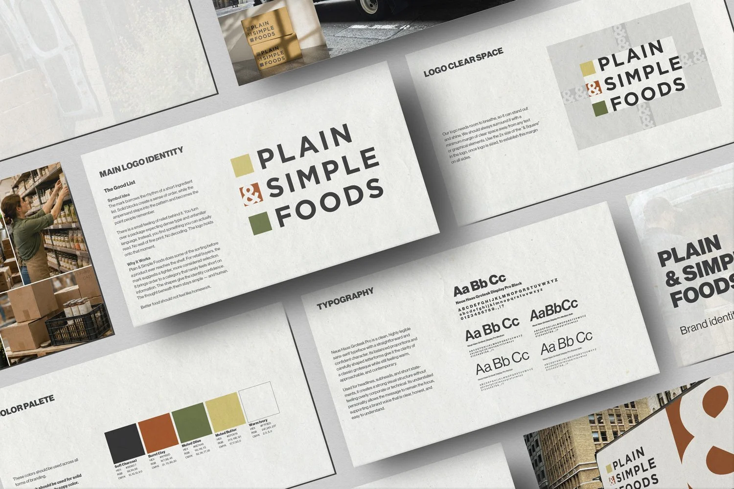
Plain & Simple Foods was planned as a distributor of cleaner, allergen-friendly foods for grocery and retail shelves in Ocala, Florida. The problem was bigger than making the company look healthy. It needed to show buyers that someone had already done the sorting: checked the ingredients, vetted the companies behind them, and found products shoppers could understand without decoding the label. Clean, but not clinical. Personal and straightforward, not another food company hiding behind fine print.
The Good List became the lead direction. The name was arranged like a short ingredient list, bringing order to a category that rarely feels short on information. Solid blocks gave the mark structure, while the ampersand stepped into the pattern as the detail people would remember. The idea was simple: Plain & Simple Foods would clear away some of the noise before a product ever reached the shelf. Better products. A more considered selection. Less homework for everyone involved.
The startup was cancelled before the identity moved beyond early logo concepts. The supporting brand guide shown here was developed to demonstrate how The Good List could have grown into a broader visual system.
-
R&R Shamion Trucking handles excavation, logging, transport, hauling, and compacting in Iron River, Michigan. A truck would have been the obvious place to start.
It also would have told only part of the story.
The problem for 43˚ North Design was finding one idea that could hold the company’s full range of work together while still feeling tied to the place behind it. The identity needed to say more than trucking without turning into a checklist of equipment and services. It also had to carry the pride, independence, and toughness that come with working in Michigan’s Upper Peninsula.
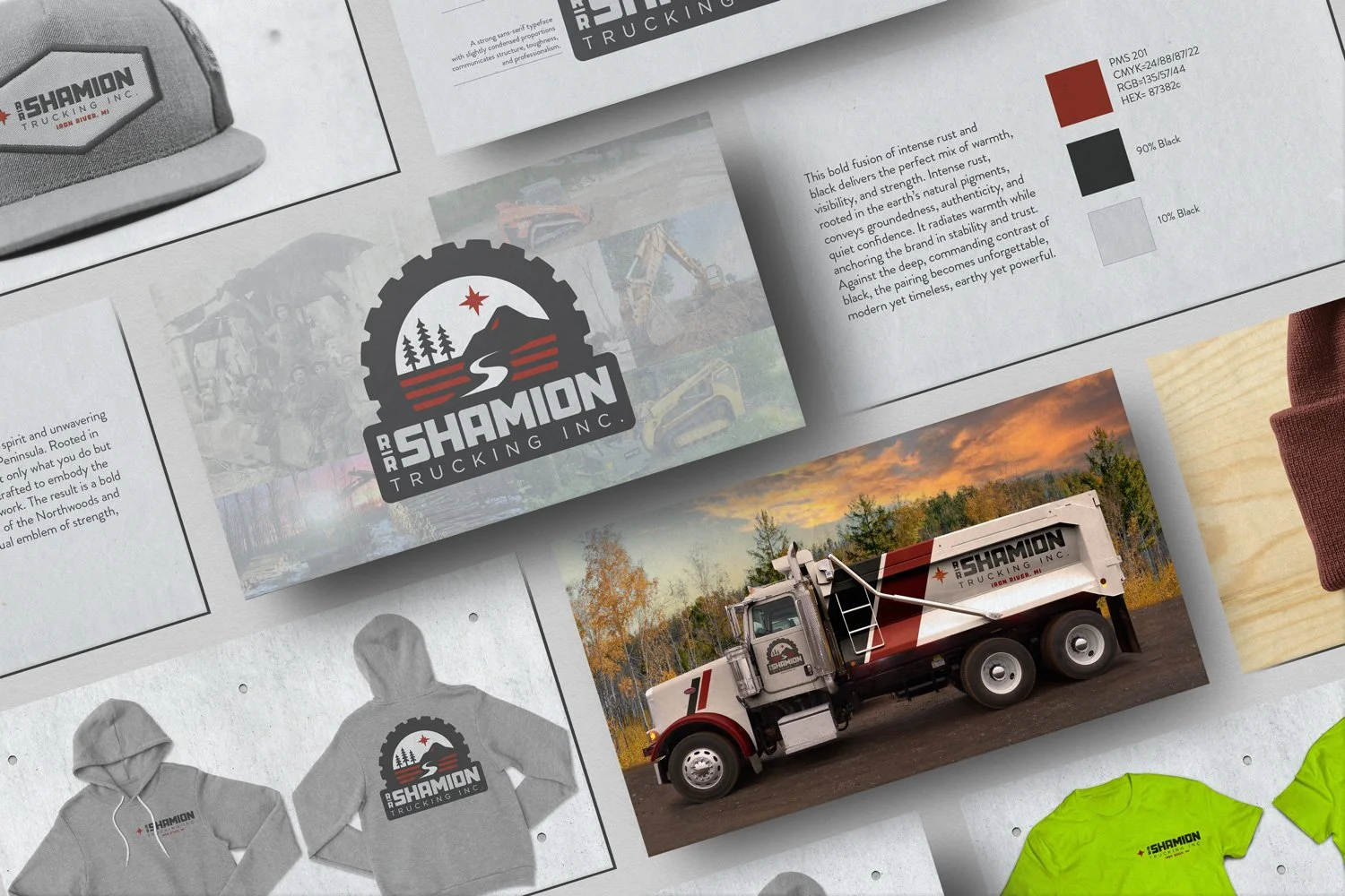
The Northmark grew from the land and the work rather than one specific vehicle. A truck-tire frame nods to transport, while a Northwoods horizon and North Star tie the company to Iron River and northern Michigan. Layers of ground speak to excavation and the work happening below the surface. An “S”-shaped trail runs through the landscape, bringing movement into the mark and connecting it back to the Shamion name. Rust, black, and condensed typography keep the direction sturdy and practical.
The project remained a concept exploration, with supporting apparel and vehicle graphics developed to show how the idea could carry beyond the logo.
-
A logo usually gets blamed first.
Sometimes that’s fair. Other times, it’s only the part of a larger problem people can see.
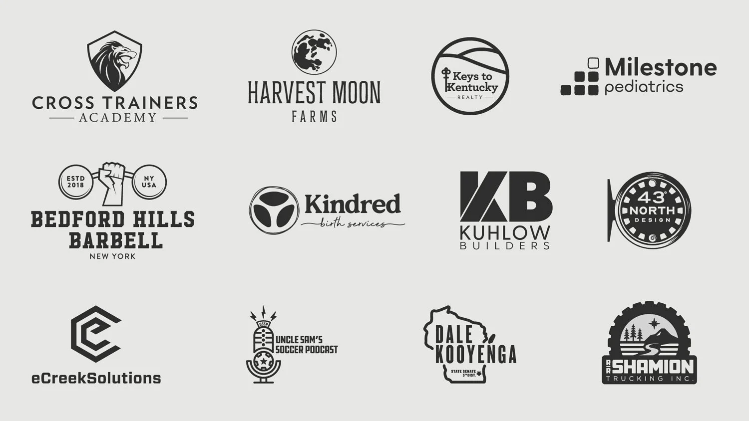
43˚ North Design starts by figuring out what the logo actually needs to do. What should people recognize? Where does it have to work? Once that is clear, the design has somewhere to go.
The result is a logo that fits the business now and still makes sense years from now.
Not sure whether the logo is the real problem? That’s a good place to start.
-
Most graphic design problems do not arrive as one big project.
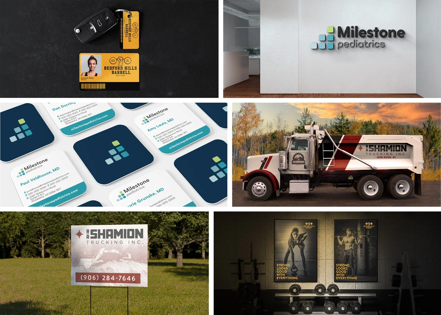
They show up piece by piece. A brochure that feels disconnected. A sign that looks like it belongs to another company. A sales sheet rebuilt from scratch because there is nothing solid to work from.
43˚ North Design looks at what is already there, what needs fixing, and how the next piece fits into everything around it. Business collateral. Print materials. Signage. Campaigns. Whatever the project calls for.
The goal is not more design.
It is making the work easier to use and the business easier to recognize.
Have a project that does not fit neatly into a service list? That’s fine. Bring me what you have.
43˚ North Design creates social media graphics and reusable templates that give your business a consistent starting point. Some projects need a set of finished posts. Others need flexible layouts your team can update with new photos, messages, and offers.
The goal is simple: make the next post easier to create without letting everything start to look the same.
Need finished graphics, reusable templates, or a little of both? Let’s figure out what will be most useful.
LET’S TALK SOCIAL